Canon: Final product & feedback
Responses and feedback from the first front magazine cover design

These responses are about what they like about the design. These are positive responses and they talk about what they like about the design. The first response is about the layout of the images. I am glad that my audience likes the layout of the pictures as I wanted one to be the background and I wanted four different locations in the photo collage.
I like how they like the layout and they understand what the front cover is about and how it fits well with the Canon Journey campaign.
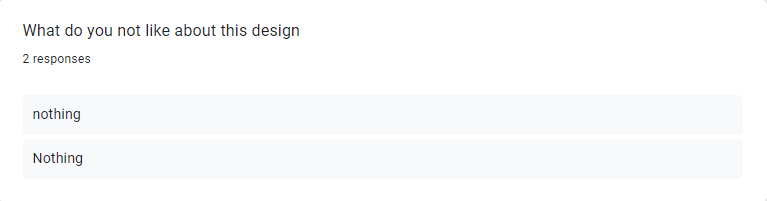
This response tells me that they like the design of my front cover and there is nothing that they don't like whether this is the position of certain information on the front cover.
This is good feedback as I did put a black shadow around the text that is on the beach but the font must not have made it separate from the beach colour and white text. For this reason, I am going to change the colour to black as I want people to be able to see the text clearly.

The person who said not sure this might be because they can't think of something or cannot think about a type of detail of the front cover. The person who said about adding more information, they could be right as there is not a lot of information but the reason why I did this was that I wanted a little inspiration to inspire people to shoot their travel. I wanted to focus on the pictures rather than the text.
This links to the last question, as it has been mentioned twice I am going to change the font cover for the inspired text.
Responses and feedback from the second front magazine cover design

This was not intended but as Canon do a camera for filming and photography it does make sense as someone has mentioned this, as filming your travel and photographing it links in.

I realised when I looked back on the magazine's front cover that some of the information is blurry. I think it is the "free videos online" information that is blurry. With this feedback, I am going to make it not blurry so it is clear to see.
The tagline is to represent how you should shoot images of your travel to look back on the different memories you have created while being away. The tagline in my opinion fits this very well and is also creative but some people might have a different opinion on what tagline fits this best.

The tripod I have noticed is very close to the bar code which means that it is covered by the tripod and it won't be good for purchasing.
Which front cover design does my audience prefer?

Two people have said that they prefer the first design, this preference could be based on their feedback and what they think presents Canon very well with the journey campaign. One person has said that they prefer the second one.
Overall I am going to pick my first design as my final design for my magazine front cover. This is because my audience prefers it better and I feel like it looks the best and supports the campaign more.
Responses and feedback from print advert design

Two people have mentioned that they like the layout of my print advert and how simplistic. I am happy with this feedback as even though it is simple it still gives my audience information about Dubai.
One person has said that they like how I am promoting different landmarks in Dubai. This was my intention as I wanted people to see how futuristic Dubai is compared to some places.

The tagline has been mentioned twice for two different designs. Even though this is the case I am still going to keep the tagline as in this print advert it means that you should shoot your travel in Dubai as you will be going to different places that are photographic and many people take pictures of.

The final product of the first magazine front cover design
This is my final product based on my feedback, I have made the text on the bottom black so it makes it easier for people to read.
The final product of the second magazine front cover design
This is the final design for my second magazine front cover. I had removed the "free video" promotional from the bottom right as I felt like moving the text would make it look a lot better. I also added Canon's website as I forgot to add that in the first draft. I also moved the tripod away from the bar code so it was not as close as it was before.
The final product of the print advert
This is the final design for my print advertisement. The only feedback I got for the print advert was to add a camera instead of a camera lens.
My final design for my front cover
As my audience picked the first design that they prefer I made this one my final front cover design. I have made the improvements I have been advised to make and it has made the front cover look so much better. I also like this front cover as there are loads of locations that people can travel to. I also like how I have added four different inspirational quotes to inspire people to travel and to photographically document where they go and what they are up to.
My final design for my print advert
As I only made one design for the print advert it means that this was always going to be my final product, but I have made the necessary changes to what my audience has said from my Google form. The only improvement I have been advised to change was the Canon Camera lens to a full camera. This has made the camera look like an actual camera and not an eye" from what people would see at first glance.

Comments
Post a Comment