Production: Main project
The editing process of a magazine cover one
Adding a beach background colour

Adding collage of different locations

The second part of the magazine cover I started was to make the photo collage from the pictures I had chosen. The reason why I did this was that I knew that it was going to be the focal point of the magazine. I chose four different pictures from different places around the world. I did this as travel can mean what you want it to indicate whether that is going abroad or going down to your local beach and area. All four pictures resemble this as most of the pictures are from abroad but one of them is in the city I live in.
Adding mastheading

After I lined up where I wanted the collage to be I added the masthead which was "shoot you travel". I wanted this in the middle to make it noticeable and to make everything under it to be in place.
The font name I have used is "moon time" the reason why I picked this font was that it looked fancy but was readable. Also, it makes the masthead stand out as it is not basic.
Adding small text

Adding bar code, price, website and Canon Camera

Underneath this all, I have the bar code and price on the left side and the Canon website on the right side. I have put these on the bottom because it is the least important information on the magazine front cover from the creator's side. I noticed when I did some research that these elements of the magazine front cover are normally at the bottom and not a big size. The reason why I did this was that I wanted people to notice the travel information I have provided and once they have looked at this information they will be able to see the information that they need to purchase the magazine.
The website and the price of the font are "Canva sans" I wanted these to be basic as they are important for a front cover magazine but for making the text fancy it is not that kind of text.
Underneath the quotes, I have added a picture of a small compact Canon camera (canon powershot SX730HS). I added this camera to the front cover of the magazine as it is the type of camera that is perfect for travelling as it does not take much in your bag or suitcase. This camera also has all of the features that you are going to need to capture great images on your trip.
The editing process of the magazine's front cover two
Adding background

I wanted this to be planned and look different to the first design. The way I did this was by making the background an image of a travel destination that I have been to. This was the first thing that I imported as it would make everything that I need to add structure better. The background image I chose was Turkey boat marina Dalyan. This town is known for boat trips as it is a popular fishing place. I made this picture the background because it is quite popular for people to get boat trips no matter where they are in the world. I also knew that having this as a background would mean that it is a focus point for the type of activities you could do when you go abroad. This means that it doesn't just inspire you to 'shoot your travel' it also inspires people to do different activities and trips while you are there.
Adding mastheading

After I added the background image I added the masthead and positioned it in the middle of the page. I knew that if the masthead was going to cover some of the important background images, I could move it somewhere else. Luckily it did not cover anything that I really needed so I left it in the middle of the front cover.
The font I have used is "Libre Baskerville" I want this to be easily readable and not look too fancy. I also add a black shadow behind the text as I want it to not blend into the background and I want to pop out of the front cover magazine.
Adding small text about the location

The font I have used for all of the text is "Canva sans" I wanted to make sure that all of the text is easily readable and have a consistent theme for the text style.
Adding bar code, and Canon camera

After I did this I added the bar code on the left side of the front cover. This is the same position where I have the bar code on the previous front cover design.
I have also used the font "canva sans" for the website and the price. I wanted this to be kind of basic as I wanted people to easily see the text and know where this location is.
I have added a picture of a small compact Canon camera (canon PowerShot SX730HS). I added this camera to the front cover of the magazine as it is the type of camera that is perfect for travelling as it does not take much in your bag or suitcase. This camera also has all of the features that you are going to need to capture great images on your trip.
Print advertisement design
I only created one design for the print advertisement as I knew that this was what I wanted to focus on for my print advertisement. I knew that I wanted to focus on one location as in my front covers I picked different locations. The location I picked was Dubai as I have been lucky enough to go there a few times, and it has great locations that you can take pictures of, and there are loads of different types of activities you can do.
Adding background image

The first part of the print advertisement I did was to add in the background image. I did this just as I did the second front cover magazine design. This time the image was Dubai Burji Al Arab and it is a bright daytime image. This image was taken in a different place and has a lot of nature around it I felt that it looked different compared to the different pictures I have of that hotel.
Adding mastheading

I then added in the masthead and I wanted to keep 'shoot your travel' in but as this is only based on one location I added in Dubai. I did this as if I wanted to create another type of print advertisement I could have a similar design and the title would mention a different location.
The font for the masthead is "libre Baskerville" I wanted this to look simplistic but also effective. I underlined the masthead as I wanted it to look nice and professional for a print advertisement.
Adding small images

I then added three small images of popular tourist spots. I wanted to get these similar sizes but as some of them were shot portrait or landscape so I made them the same size by cropping out parts of the image that was not necessary. The popular tourist spots of Dubai I picked were Dubai Frame, Burji Khalifa and Desert safari. The images of the buildings were taken outside and the safari was taken during the trip at sunset. I added a border around each of the pictures to make it stand out from the background image.
Adding small text of the location names

Underneath each of the images, I added small text about what that building or trip is called. This is because it makes it helpful for people viewing the print advertisement to see what that building is called and they will find out what the name of the trip is as well.
The font for the name of locations is "libre Baskerville" I wanted to keep this font the same as I felt like it went well with the background and the overall vision of the print advertisement. I added a slash to separate the different text and images.
These are all my first drafts of the magazine front cover and print advertisement. I have noticed that I need more information about different topics of what I am promoting on the front covers.
Adding a Canon camera lens
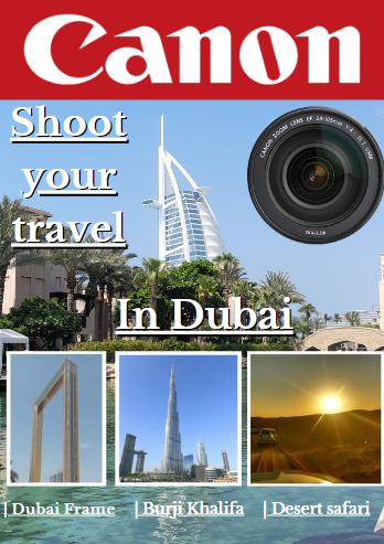
I have added a Canon lens as I wanted people to know that the magazine inside is also about Canon. I chose the lens as it differs from the front covers. I also used a lens to see if my audience prefers it to a normal-size camera as I felt like this was a different route to take compared to my magazine front covers.

Comments
Post a Comment